Home styling · Fabric care
Decorative Pillow Covers: Balancing Fabric, Pattern, and Care
A pillow cover can change the mood of a room with the economy of a well-chosen sentence. It may soften a spare arrangement, sharpen a quiet one, or introduce a note of color that appears to have been there all along. The successful choice, though, is not merely the prettiest fabric on the shelf. It is the one whose texture, pattern, proportions, closure, and care requirements make sense together—and make sense in the life of the room.
Published November 21, 2026
The small object with a large assignment
Decorative pillows are asked to do several things at once. They should look composed but not overthought, feel inviting without becoming shapeless, and survive the casual indignities of ordinary use: a book laid on them, a guest’s elbow, a pet who has mistaken the sofa for a sunlit meadow. The cover is the visible part of this arrangement, but it is also its most practical part. It sets the tactile tone, determines how the color reads, and, eventually, decides how much effort cleaning will require.
It helps to begin with a question more useful than “What matches?” Ask instead what the room needs. A room full of smooth surfaces may want a nubby weave or a little fringe. A bed already dressed in florals may need a plain accent with a clear edge. A chair in a deep color might welcome a pale cover that catches the light. The aim is not perfect coordination. It is a relationship: a conversation among the pillow, the furniture, the bedding, and the rest of the room.
Because covers are relatively easy to change, they can also provide a low-commitment way to alter a room’s emphasis. A single patterned pillow may bring a botanical note to a neutral bed; a pair of quiet solids can calm a sofa whose upholstery has a strong personality. Yet change is not the same as accumulation. A considered arrangement usually gives each accent enough room to be seen.
Fabric: softness, structure, and the hand
Fabric announces itself first by touch, then by the way it holds a shape. Linen and cotton often have a relaxed, familiar character; a crisp cotton percale can look tailored, while a looser weave may feel more casual. Velvet gives color depth and a soft, light-catching surface. Wool blends and textured weaves bring visual weight, useful when a room’s other materials are smooth or reflective. Silk, meanwhile, has a fluid drape and a subtle sheen that can make even a restrained color feel occasioned.
These descriptions are starting points, not promises. The construction, weight, finish, and quality of a fabric all influence its behavior. A thick cover can make a small cushion look substantial; a fine, pliable fabric tends to follow the insert rather than impose its own geometry. If the room benefits from crisp outlines, choose a material with enough body to keep its corners. If the goal is softness, a more yielding fabric may be the better choice.
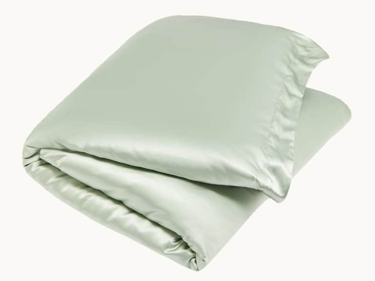
Silk pillow covers, including printed styles, can be especially effective where a smooth finish and delicate pattern are wanted. Their sheen changes with the light, so a color that seems quiet in the morning may become more vivid by lamplight. Silk is also a delicate fibre, and the care instructions matter. Some pieces can be washed gently; others require professional cleaning. Before buying, consider whether the fabric’s particular presence is worth the attention it asks for.
A useful comparison is the difference between an accent that invites use and one that seems to ask for distance. Neither is inherently better. A decorative cover in a precious fabric can give a bedroom a sense of ceremony, while a durable cotton cover may be preferable on the sofa where people actually sit. The best selection follows the location: a formal bed, a well-used reading chair, and a family-room sectional do not have identical demands.
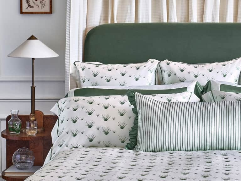
For an example of pattern carried by a smooth fabric, the Lily of the Valley Silk Pillowcase pairs printed white flowers and green leaves with contrasting green trim and an Oxford border. It is a pillowcase rather than a decorative cushion cover, but its design offers a useful lesson in how a botanical motif and a defined edge can give a pale ground more character without filling every inch with ornament. Its care guidance calls for a delicate machine cycle at no more than 30°C, mild liquid silk or delicate detergent, air drying, and cool ironing.
Pattern and color: making room for contrast
Pattern is most successful when it has somewhere to land. A floral print beside a plain wall can feel expressive; the same print beside patterned curtains, a patterned rug, and a patterned duvet may become a small committee meeting. This does not mean that patterns cannot be mixed. It means their scale, palette, and visual weight should be considered together.
One reliable approach is to vary scale. A large botanical motif can sit comfortably beside a fine stripe or a small geometric repeat, especially when both share one or two colors. A quieter combination might pair a solid cover with a narrow border, letting the edge provide definition. Pattern can also be distributed unevenly: one patterned pillow among solids often reads as an accent, while several equally busy designs may compete for attention.
Color relationships do not have to be exact matches. A cover may echo the green in a plant, pick up a muted tone in the rug, or introduce a complementary shade that is absent elsewhere. Repetition is helpful, but it need not be literal. A warm neutral in the pillow can relate to wood furniture; a deep berry tone may give a pale bed a little gravity. The room becomes coherent through recurring qualities—warmth, softness, contrast—not through a requirement that every object share a swatch.
Look at the cover in the conditions where it will live. Daylight can reveal undertones that a shop’s artificial lighting conceals. A glossy fabric reflects more light than a matte one; a dark pattern may appear denser against a light background than it does on a screen. If possible, compare the cover with nearby textiles and furniture, and view it from the usual distance. A design that looks intricate close up may read as a single block of color across the room.
There is also a difference between a pattern that leads and one that supports. A pillow on a quiet bed can carry the room’s strongest motif. On a sofa with striking upholstery, a simpler cover may be more useful, allowing the furniture to remain the principal event. Decorative pillows are not obliged to be modest, but they do benefit from knowing their role.
Shape, dimensions, and the matter of the insert
A cover’s dimensions are not a minor detail hidden at the end of a product description. They determine whether a cushion looks crisp, relaxed, overstuffed, or oddly slack. Measure the insert as well as the cover, and check whether the stated dimensions refer to the finished cover or to the cushion it is designed to fit. A cover that is too large may sag at the corners; one that is too small can strain its seams or distort its pattern.
The shape should suit both the furniture and the intended use. Square covers are versatile and easy to arrange. Rectangular cushions can add a lower, longer line across a bed or sofa. Bolster covers create a more pronounced silhouette and can serve as a decorative feature or as support while reading or lounging. Frills, piping, knife edges, and borders all change the outline. The detail that looks elegant in a photograph should also make sense against the shape of the cushion.
Insert choice matters, too. A firm insert gives a pillow a more upright, tailored appearance; a softer one lends a relaxed feel. The same cover can look markedly different depending on what fills it. Before replacing an insert, check that it fits the cover and that its loft suits the room. A cover is not a substitute for a well-proportioned cushion, though it can make an existing one look newly considered.
When a pattern meets a seam or a border, placement becomes part of the design. A centered motif may look deliberate; an awkwardly cropped one can seem accidental. On a plain cover, the construction may take over as the visual detail. An Oxford border, a contrasting band, piping, or a frilled edge can supply structure without adding another print. These finishes are most convincing when they relate to the room’s other lines—perhaps the edge of a duvet, the profile of a chair, or the trim on a curtain.
Closures: the detail you notice later
A closure is easy to ignore until it catches on something, shows at the front, or makes the cover frustrating to remove. Envelope closures overlap fabric at the back or side, keeping the finish relatively discreet. Zippers can provide a neat, secure opening, especially when well placed and finished. Buttons may contribute a decorative note, although their position and construction affect both comfort and ease of laundering.
There is no universal best closure. The right one depends on the cushion, the fabric, and how often the cover will be removed. A cover used on a high-traffic sofa may benefit from an opening that makes cleaning straightforward. A decorative piece that is rarely handled may tolerate a more elaborate construction. Check the closure’s position as well as its style: a hard or bulky fastening at the point where someone leans can be an unfortunate design decision.
Closures also affect the way a cover sits. A carefully finished envelope can keep the back looking orderly; a zipper can help the fabric fit closely around the insert. Whichever design is used, avoid forcing the cushion through an opening that is too small. Pulling hard can stress seams, snag delicate fibres, or distort the cover before it has had a chance to do its job.
Care: read the label before falling in love
Fabric care is not a footnote to the purchase. It is part of the design. A cover that requires dry cleaning may be entirely appropriate in a formal room, but less convenient where spills are likely. A washable cotton cover may suit everyday use, while a delicate silk or embellished fabric may call for gentler handling. The important question is not whether one care method is superior; it is whether it fits the household’s habits.
Always follow the specific instructions supplied with the cover. Fibres and finishes that seem similar can behave differently under water, heat, agitation, or detergent. If a label recommends dry cleaning, do not assume that a gentle home wash will produce the same result. If machine washing is permitted, check the recommended temperature, cycle, detergent, and drying method. For delicate pieces, cool water, mild detergent, and air drying are common instructions—but the product’s own care guidance should take precedence.
It is sensible to remove the insert before cleaning and to close zippers or fastenings where the instructions advise it. Treat stains promptly, but avoid vigorous rubbing, which can spread a mark or abrade a surface. Test any spot treatment in an inconspicuous area, especially on printed or richly colored fabric. Do not tumble-dry a cover unless the care label explicitly allows it: heat can shrink fabric, affect a finish, or leave the cover difficult to refit.
For covers that are not frequently washed, regular light maintenance helps. Shake out dust, turn cushions periodically so wear is distributed, and keep delicate fabrics away from prolonged direct sunlight, which can fade color. Store seasonal covers clean and fully dry, folded loosely rather than crushed beneath heavy items. These small routines are less glamorous than choosing a print, but they are what allow the print to remain pleasing after the first season.
A practical way to choose
Begin with the room’s existing materials. Note the dominant colors, the most noticeable patterns, and the textures already doing useful work. Then decide what the new cover should contribute: softness, structure, a point of contrast, or a modest repetition of an existing color. This first decision prevents the familiar drift toward buying an attractive object simply because it is attractive.
- For a calm arrangement: choose a restrained palette, a tactile fabric, or a simple border. Let texture carry the interest.
- For a room that feels flat: introduce a contrasting weave, a deeper color, or a pattern with a clear relationship to nearby textiles.
- For a patterned room: consider a solid cover or a print with a smaller scale and a shared color.
- For everyday seating: prioritize a durable construction, a practical closure, and care instructions you can realistically follow.
- For a delicate accent: check how it will be cleaned and where it will sit before deciding that its finish is worth the upkeep.
After that, verify dimensions and construction. Confirm the cover suits the insert, note whether the closure is convenient, and look closely at borders, seams, embellishments, and pattern placement. A photograph can suggest the overall impression, but the specifications explain how the cover is made and maintained. If a detail is unclear, it is better to find out before purchase than after the first wash.
Finally, consider the number of pillows. A carefully chosen single cover can have more presence than a crowded collection. On a bed, a few varied shapes may add depth; on a smaller chair, one well-proportioned cushion may be enough. There is no standard formula, only the question of whether the arrangement leaves the furniture usable and the room legible.
The pleasure of an accent that works
The appeal of decorative pillow covers lies partly in their modest scale. They allow a room to change without requiring a new sofa, a fresh coat of paint, or an elaborate explanation. But their smallness can make them deceptively exacting. A color that is nearly right, a pattern that is slightly too assertive, or a cover that cannot be cleaned in the way a household needs may turn a promising accent into a persistent irritation.
Fabric, pattern, shape, closure, and care are not separate boxes to tick. They are parts of the same decision. A fluid silk with a botanical print asks to be handled differently from a crisp washable cotton with a restrained border. A bold color may be right for a quiet room but unnecessary beside already lively upholstery. A zipper may be practical, while an envelope closure may give a cleaner finish. The best choice is the one in which these elements support one another.
When that happens, the pillow does not announce the effort behind it. It simply seems to belong: a soft counterpoint to a firm chair, a green edge against pale bedding, a little pattern where the room had been too still. That is a modest achievement, but a satisfying one—and, in a home, modest achievements have a way of making themselves felt every day.